Continuing on the subject of color... we are ready to move into our Appalachian Morning home...so ready. Choosing color was a big part of planning; planning for the years we will spend there and how we want each room to "feel." The color and form/lines create the mood. What sort of mood should each room have and how will those rooms integrate to create "home"?
Swatches have been studied. Decisions have been made.
Dining/living room: creme, deep red, deep gold, forest green, teal, navy. We are drawing from the colors in a Marc Chagall reproduction that we love. Then, in the adjacent family room, the same colors will carry, but with a more informal and also modern look.
The kitchen was a no-brainer as I love blue and yellow kitchens and Mark likes french country. The master bedroom, chocolate, pale blue, forest green... My office, I want a bright green wall for some reason. All four walls or just one.... Stay tuned!
I would love to hear what colors inspire you. What in your environment encourages creativity; makes you want to craft or paint or sew?
Art & Photography ~ Writing & Books… All settled within a heart that loves creativity, trees, animals, hills, and the changing seasons.
June 30, 2008
June 25, 2008
Mermaids - a visual musing

Mermaids, sea maids — There is something alluring about them, isn't there? Yet, reading up on them reveals that they may not be completely benign, as myths go.
In my imagination, though, sea maids are wonderful creatures... Not only beautiful, but benevolent, ready to help out sailors and wayward pleasure boaters at a moment's notice. Friendly with all sea creatures, the colors of the deep are reflected in their irridescent scales, and their skin has a cool, transluscent tone.
Here is a peaceful mermaid, who has found beauty under the sea. I drew her on Bristol board with permanent markers.
June 20, 2008
Creating a Great Display of Your Photographs
As Mark and I pack up our framed photographs, loose photographs, photo albums, paintings, and photo negatives for our move (whew!).... and as I keep looking through decorating books for new ideas in our new-to-us home (with, thank goodness, a lot more wall space)... I was thinking of something I read about in a book on displaying photographs.
If you're like me, you've ended up with a hodge-podge of favorite photos, all different sizes, styles, some in color, some in black and white. Perhaps you'd like to display them together on the wall, but need something to unify them...
If you have photo-editing software (like Photoshop), you can scan the photos (or pull up your digital files) and saving under a new name (to preserve your original) start playing around with adjusting the color. By working several photographs with the same treatment (described below), you will unify the photographs visually and with similar frame, achieve unity in your arrangement on the wall. (This technique is also helpful in creating collages/memory books.)
Consider these photos and their treatments:
Here is a photo of my friend, David Pike. It was taken outside on a sunny day at The Inn at Cedar Falls in Logan, Ohio. There is a lot of color in the photo, but I wanted to focus on my friend...
 ...so...I have gone into Photoshop, cropped it a bit, and chosen "image" > "adjustments">"photo filter" and "sepia." Which do you prefer?
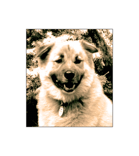
 Next, here's a photograph of my beloved dog, Buster, from years ago. The original photo was in black and white (taken with film) and scanned into my computer.
  Though I usually love black and white, this seemed too harsh to me. It must have been a sunny day or perhaps the scan was just set at too high of a contrast.
So, I decided to alter this in Photoshop. First, I made sure the "mode" was changed from "grayscale" to "RGB." Then, under "image">"adjustments">"photo filter," I chose "orange 70%" and warmed up Buster's photo. But, in this case, I ended up preferring the original black and white photo. That's why it's important never to work on the original, work on a copy of it.
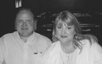
 Mark and I had gone to a Japanese steakhouse with my sister, Joan, for Mark's birthday in May. It was a lot of fun and we had the waitress take our photo. Unfortunately, their camera setting was off and we ended up looking like we'd been out in the sun too long. Also, Joan's eyes were closed.
Still, I wanted something to remember this night by in our photo album, so I scanned the file, converted it to "grayscale" in Photoshop, and cropped Joan out of the photo.
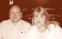
Ugh, it looks like a poor newspaper photo... Not really an improvement at all.
I tried sprucing it up by going converting it back to RGB and then going to "image">"adjustments">"hue saturation"> and fooling around a bit with the color. I like this version better. But, it really shows that you have to start with a good photo to get anything worth hanging on your wall. I think I'll save this for the photo album only.
Using photo-editing software, you can tint the photograph to match the warmth or coolness of the room where you are going to display it.
Here's a photo of my bird, Bailey, taken a few years ago. Bailey, like Buster, passed away, and this is one of my favorite photos of her.
Here are tips from "Mom Central" on displaying family photos.
If you're like me, you've ended up with a hodge-podge of favorite photos, all different sizes, styles, some in color, some in black and white. Perhaps you'd like to display them together on the wall, but need something to unify them...
If you have photo-editing software (like Photoshop), you can scan the photos (or pull up your digital files) and saving under a new name (to preserve your original) start playing around with adjusting the color. By working several photographs with the same treatment (described below), you will unify the photographs visually and with similar frame, achieve unity in your arrangement on the wall. (This technique is also helpful in creating collages/memory books.)
Consider these photos and their treatments:
Here is a photo of my friend, David Pike. It was taken outside on a sunny day at The Inn at Cedar Falls in Logan, Ohio. There is a lot of color in the photo, but I wanted to focus on my friend...
 ...so...I have gone into Photoshop, cropped it a bit, and chosen "image" > "adjustments">"photo filter" and "sepia." Which do you prefer?
 Next, here's a photograph of my beloved dog, Buster, from years ago. The original photo was in black and white (taken with film) and scanned into my computer.
  Though I usually love black and white, this seemed too harsh to me. It must have been a sunny day or perhaps the scan was just set at too high of a contrast.
So, I decided to alter this in Photoshop. First, I made sure the "mode" was changed from "grayscale" to "RGB." Then, under "image">"adjustments">"photo filter," I chose "orange 70%" and warmed up Buster's photo. But, in this case, I ended up preferring the original black and white photo. That's why it's important never to work on the original, work on a copy of it.
 Mark and I had gone to a Japanese steakhouse with my sister, Joan, for Mark's birthday in May. It was a lot of fun and we had the waitress take our photo. Unfortunately, their camera setting was off and we ended up looking like we'd been out in the sun too long. Also, Joan's eyes were closed.
 Still, I wanted something to remember this night by in our photo album, so I scanned the file, converted it to "grayscale" in Photoshop, and cropped Joan out of the photo.

Ugh, it looks like a poor newspaper photo... Not really an improvement at all.
I tried sprucing it up by going converting it back to RGB and then going to "image">"adjustments">"hue saturation"> and fooling around a bit with the color. I like this version better. But, it really shows that you have to start with a good photo to get anything worth hanging on your wall. I think I'll save this for the photo album only.

Using photo-editing software, you can tint the photograph to match the warmth or coolness of the room where you are going to display it.
Here's a photo of my bird, Bailey, taken a few years ago. Bailey, like Buster, passed away, and this is one of my favorite photos of her.
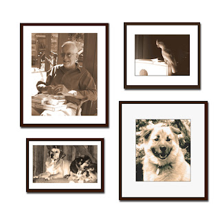
 I changed it to sepia and actually like it better. If I were to do an arrangement of photos using the one of David, shown earlier, and this one of Bailey, they would look well together. Let's see...
If I work a bit more on Buster's photo (changing to "sepia" and also adjusting the brightness), AND, if I add in a photo of Buddy and Puck (David's dogs). Their photo was in color, but I've altered it to match these. I then put frames around these, still in Photoshop, and could move them around and see just how this arrangement might look on my wall. This sure beats pounding a bunch of holes in the wall as I changed my mind---back in the olden days before computers.
Of course, there is still an art to arranging photos on the wall, once you've got them the way you want each photo to look--and a unified theme or style. Check out Decorating with Pictures by Stephanie Hoppen for tips on that subject (available on Amazon), as is Decorating with Family Photos by Ryne Hazen and Teresa Hazen.

And another "The Meaning of Family Photographs" by Charles Williams (no relation).
Here are tips from "Mom Central" on displaying family photos.
June 15, 2008
The Diana and Diana+ Cameras

The following article was first posted on my pet blog at the Seattle Post-Intelligencer. Since it addresses creativity and photography, I am posting it here, for those of you who may not be familiar with the Diana and Diana+ cameras.
Pets offer many opportunities to explore one's hobbies and creative interests, such as photography, painting, drawing, knitting/crocheting, baking, scrap booking, and more. Today, I'd like to share with you my latest hobby, taking photos with a plastic, "toy" camera known as the Diana.

This past Christmas, Mark gave me a Diana+ camera (an upgraded version of the original Diana camera). I had first learned of the camera after visiting a photography exhibit a few years ago of Nancy Rexroth's photographs at the Columbus (Ohio) Art Museum. I came home and looked up Rexroth's work online and learned about the Diana camera. Something about that black and blue plastic camera and the photographs it offered fascinated me. (Not to imply anyone can reach Rexroth's level of artistry, but I wanted to try it out for myself.)
In the past, the Diana camera was considered a toy really, even a give-away in some cases. Today, you can buy original Diana's or Diana-type cameras from other enthusiasts and online auctions. I've listed several links at the end of this article.
As mentioned, the Diana+ camera is the new model and mine arrived with a beautiful hardcover book full of snappy marketing copy and color reproductions of Diana+ photos. The main thing to know about these cameras is that the Diana or Diana-type cameras are adjustable (shutter speed, double-exposures possible as well as one long panoramic shot taking up a whole roll of film, etc.) and unpredictable (not quite what you see through the viewer).
I am interested in collage and altered art and thought the camera would be a nice addition to my toolbox. When Mark and I saw one featured in a "last-minute holiday gift" segment on the Today Show, I remarked, "I've always wanted one of those cameras..." (Being married only five months, you won't be surprised to hear he was listening.) The camera arrived Dec. 26th.
After some confusion on my part as to film type (it takes 120), I purchased several rolls of black-and-white film and began shooting. Pets are the main focus in our home, so no need to look far for subject matter. In this article, you can see my first attempts at photographing Jackie. I upgraded to color for roll 3, as you can see with Farley by the fireplace and Gracie by the window.

The colors are rich, much richer than photos taken with my Kodak Easy Share digital camera (which takes excellent pictures and was a good buy). But the Diana camera seems to capture the atmosphere. I was surprised to find that by the third roll I had gotten the hang of how long to hold the shutter open (there are two settings: automatic shutter speed for outdoors and manual speed for indoors). Basically, I count to two. Farley's photo came out so clear! If only I hadn't cut off the top of Gracie's head!
 The links that follow can give you more practical information and additional examples of photos taken with this type of camera:
Of course, this camera is also great for taking atmospheric photos of your favorite people. Here's one I took of my sister, Joan Phelps.

June 11, 2008
Paintings Commemorating Cancer Journeys

Thinking more about color, which I mused on yesterday in regards to decorating one's home. I thought back to abstract explorations of color and symbolism that kept me busy for many hours during the early months of 2006.
I was recovering from an illness that ended up leaving me pretty worn out from late 2005 until successful surgery and relief in the fall of 2006. So, during the winter months of January and February and March... I often liked to sit in my comfortable chair, with all my Sharpie markers nearby and sketch on Bristol Board, 14 x 11 or 8.5 x 11, while watching TV.
The picture above was done on larger paper (hot-pressed D'Arches watercolor), it was an invitational piece done for Lily, a pharmaceutical company, for their annual "Oncology on Canvas" exhibition (London and also traveling around the US). http://www.lillyoncologyoncanvas.com/index.jsp (click on "Launch 2006 gallery) and then search for "Life and Being ID: 395."
Part of the entry process was the written description of the artist's cancer journey (personal or in relationship to a loved one with cancer), and mine is at the end of this article.
As the winter wore on, I did many drawings with this same style. Most of them had egg shapes, a few had trees, rivers, roots. It was wonderful to explore these symbols and colors with no thought as to "earning money" or "selling them." Just for the joy of doing them. (I'll post more soon.)
I wonder what other artists do, who make their living with their art--they need that income to support themselves, but yet there is something lost in work that is done with one eye on the checkbook. So, what do they do for themselves?
For me, there is a wonderland to explore in all the exists beyond the commercial. I am traveling to that wonderland as I age.
When I was an art student, my professer told me that as I got older and knew myself, my work would improve--I would have all my life experiences to bring to it. He was so right (thanks Mr. Rohn). I imagine he was in his mid-forties at that time; a large man who battled a stutter but also played the mandolin and sang beautifully. He took us on hikes in the local park and helped us to "see" the shapes in nature. He graded hard; to get an A in his class was a real accomplishment. I've not forgotten the lessons I learned years ago in his class.
I was reading a book by Sue Miller recently, and there was a line in there about how mothers see their children at all the ages and stages they ever were, simultaneously. I thought, how true that is.
Perhaps our personal artwork allows us to be everything we ever have been simultaneously...it is all there embedded in our work. And, then in this piece "Life and Being" I am commemorating someone else's life, so their life and mine merge to be unique. Though the subject, Joe Kahn, was known far better by his blood family, loved better, and longer by them; my story about him was still mine, no one else's. We each have our own stories and they are all worthwhile. They come out in our artwork, sometimes in spite of ourselves.
"Life and Being", description (right click and "open in new window" and it will be large enough for you to read):

Postscript: I have just read more information on the exhibit and the submission process in a press release that is posted on another blog. Lily is accepting submissions for the next exhibit up until July 15, 2008.
June 8, 2008
Choosing Color: What inspires you?

As we get ready to move into our new home, I'm musing on furniture layouts, wall colors, how to set things up to feel like home and to be beautiful and comfortable.
In the house I lived in before Mark and I married and I moved into his condo, I had, a few years ago, redone the master bedroom and painted the walls the colors of my parrot, Gracie. Two walls were pale green, one wall was lavendar, the carpet was grey, the accent color was red. It sounds like a lot, but it was beautiful. I found a comforter with lavendar, green, and blue and drapes with tiny strips of lavendar, green, and red. It all worked great and I loved resting and reading in that room.
Yesterday, armed with a load of decorating and color books from the library, I spent a lot of time thinking of color and how important it is to our lives. And how it can affect our moods, and inspire us in so many ways.

One of the books encouraged thinking about what color combinations we are drawn to. In addition to Gracie's interesting colors, I am drawn to the colors of fall (deep oranges, reds, golds, and browns), winter (pale blue, beige, white, grey; like in the photo at left), and spring (pinks, lavendars, daffodil yellow). Oh, it's so difficult to choose!
I have oodles of photographs taken of trees, landscapes, animals...sometimes just for the color. For five years I drove two hours on most Saturdays to visit my son. It was on a rural road in southern Ohio and I found myself thinking of some of the trees along the way as nature's friends. I loved seeing them change with each passing season; appreciating the changes in a way that only someone who lived in Florida for 17 years, and wasn't crazy about it, could. Here is a photo of a scene I passed often, and found quite beautiful.

Then, in thinking about color, I remember a photograph I took of light coming into a window, through and old yellowed shade...it reminds me of an abstract painting, lit from within (see photo below). Then there is a photo I took of some rose petals that had dried to a color that looked interesting to me...


Color, color, color... and then there is texture, a whole 'nother thing to consider. After looking at several books I felt like I'd eaten too much of a good thing. My eyes and brain needed a break.
As much as I like to paint "real" things, I also like to paint just color. Here's one I did for my son, Jesse, last year. Perhaps it was inspired by the photo I took years earlier of the windowshade. I did a similar smaller blue one as well that I gave to Mark. I loved doing these. Perhaps I will start the decorating thoughts by getting out paintbrush and canvas and musing a bit more on what colors speak to me.

How about you? What colors fill you with happiness, creativity, or remind you of particular events or times in your life? What is your favorite color?
June 7, 2008
Drawing Cats

My son, Jesse, turned 25 last month and as I was sitting in Ohio missing him (in Philadelphia) I took up my favorite pen and did some sketches. Mark and I like to watch TV most weeknights (mostly British mystery series, or comedies, or...this particular night I believe it was Dancing with the Stars) and it's easy to have pen and paper nearby and do some sketches. These two with the cat celebrate Jesse's cat, Tyrone. (He's all black, but I kept with the linear look.) The paper I used had a glossy finish; I'd bought it at a scrapbooking convention in Columbus (OH). I believe it's 4 x 6 inches.

I spend a lot of time drawing dogs, flowers, wildlife, parrots... but not so much cats. That might change now, as I really had fun with these. And....
Last week I was at the Cat Welfare Association Open House in Columbus, for a booksigning. Afterward, cats on the brain, "Wire in the Blood" on the tele, I drew this below. I'm finding out, just how cute cats are and how much people like them.

Then, Mark and I were on Court St. in Athens, and we went into the University Bookshop where they had a table with sale items.... Drawing Cats and Dogs, $6.99. Great deal. I got it. It wouldn't hurt to understand cat anatomy a bit better. No... we cannot get a cat; I am allergic to them. But they are fun to draw and I like imagining scenes with them...
Life comes full circle...
 The photo at the right was taken many years ago (no, I'm not telling how many) in West Virginia. I was there the summer between my junior and senior years of high school to attend a Watercolor Workshop put on by Bill Gerhold. I was one of two 17-year-olds there; everyone else was in their 30s, 40s, and beyond. It was a great experience.
This photo was taken just prior to a bumblebee crawling up my left pant leg. I was embarrassed to have to take off my jeans to get it out, and then endure a day ill (I am terribly allergic to bee stings), but looking back I now realize it would have been far scarier for the adults in charge, had they realized I was allergic and didn't yet carry an epipen with me!
I love this photo, not just because of the jaunty plaid cap and long braids I wore back then, but because of the way it felt being in such an open, rural place. This was a magical location... we drove through a long windy dirt road to get here. There was an abandoned farmhouse near this barn...everything echoed of a life once lived here. I wondered what had happened to the family that once lived their life on this land.
I haven't any paintings anymore that I did on this trip to WV...where did they go in the succeeding decades... Those decades held a lot, but my interests and heart have barely changed. I still love the hills, meadows, farms, and the chance to paint whatever I want in an unhurried manner.
Now, my husband and I are in the midst of moving from city to small town. We'll have a house on a hill and beautiful trees extending out the back yard on and on. I'll get my hands dirty in the garden someone else started there and watch out for bees. I have an epipen now, and in many ways am better prepared to handle life's unexpected loops. But, just as I felt when my father, years ago, drove me from Canfield, Ohio to West Virginia... I can't wait to get there!
Update: 10/4/2010: In preparing a family scrapbook, I came across this photo of my father, Woodrow Phelps, taken as he and my mom drove me home from the painting workshop. We stopped at the Salt Fork Lodge central Ohio and here is a photo of my dad with his camera. He passed away twenty years ago...how I wish I could share with him that I am still painting today and that it was worth the time, money and effort he and my mother extended so I could follow my dreams!

Subscribe to:
Posts (Atom)